.png)
.svg)


Gestalt Principles Examples in Real Life - Discover Their Impact
See how Gestalt principles shape real-life design through impactful, everyday examples and practical insights.


Intuitive products that support action without friction are no magic. They’re just designed with Gestalt principles at heart. Once you understand these concepts, you’ll spot them more easily and apply them in your work.
In this guide, we cover Gestalt principles examples in real life. Equally important, we show you how to use them to design with less guesswork and more intention.
Let’s dive into what it takes to create interfaces that feel just right.

TL;DR - Gestalt Principles Examples in Real Life
To illustrate these principles, we’ve picked seven standout Gestalt psychology examples from our website and platform, HeyMarvin:
- The interface of a user interview tool
- A search dropdown menu within a research repository
- Follow-up interaction panel with tooltip
- Discussion guide list with question hierarchy
- Visual map of supported integrations
- Testimonial panel (page header)
- Robot and cat fixing a spaceship (hero section)
HeyMarvin is an AI research assistant. It conducts and collects interviews, surveys, and open feedback with automatic tagging and analysis. In short, it enables you to identify patterns and understand how users truly perceive your product.
Book a free demo to see how this tool helps you learn from your users! It’s an excellent starting point for determining which Gestalt principles to implement to improve your product.
What Is Gestalt Psychology?
Gestalt psychology is a theory that explains how the brain organizes and makes sense of the world:
- It sees whole patterns
- The mind fills in gaps and connects parts
- Ultimately, we build a bigger picture from pieces
It originated in early 20th-century Germany, when a few scientists sought to understand how people perceive things. They studied vision, space, and meaning, and discovered that the brain organizes things fast. Even when nothing obvious connects them.
Formulated by scientists, this theory slowly branched into Gestalt graphic design. In the 1950s and 1960s, these principles were applied to posters, logos, and product packaging.
However, with the rise of graphical user interfaces, Gestalt psychology found its place among the UI and UX best practices.

How Gestalt Theory Shapes Visual Perception
This theory reminds us that the brain uses shortcuts to spot patterns fast:
- Connects close shapes
- Matches things that look alike
- Completes outlines that aren’t finished
- Turns fragments into something whole
The Gestalt rules are vital in product design because they outline the shape that visual perception takes. All humans use them without knowing it. They don’t look at one button, one label, or one menu at a time. They take in the whole layout, and their brain organizes it.
That’s why, if your spacing feels off or elements don’t seem connected, it can confuse users.
But when you intentionally apply the Gestalt principles of design? Your UI feels clear, and the UX flows more smoothly. Consequently, users intuitively know what step to take next.
Gestalt Psychology Principles That Influence Design Decisions
The following Gestalt principles summarize the mental shortcuts and built-in rules that users follow when interpreting visual cues. Use them to understand how the brain “sees” and guide your product design for better results.
Proximity
Users assume that elements placed near each other are related.
By placing related elements close together, you create visual unity. Users will, therefore, be able to scan the interface without having to guess what belongs where.
Similarity
When things look alike, users treat them as part of the same group, even if they’re far apart.
According to this principle, all your primary buttons should look the same across screens. That way, users recognize them on sight.
Continuity
The eye wants to follow a path.
Whether it’s a line, a curve, or a grid, the user will keep scanning in the same direction. Use continuity to guide attention to a particular area of your website or user interface.

Closure
Even when part of a shape is missing, the brain fills in the gaps.
You can suggest depth, structure, or meaning with fewer lines. This lets you design smarter, simpler icons or logos without losing clarity. It’s also helpful for creating illustrations or loading animations that feel complete, even when not fully drawn.
Figure and Ground
Users will always see one element as the foreground (the thing that matters) and the rest as background.
A modal rises above a dimmed screen, or a CTA button pops on a quiet background. If you use contrast, white space, or layering well, you guide attention.
Common Fate
Elements that move together seem to belong together.
Animations, transitions, and real-time interactions leverage this principle. If you reveal dropdown items with the same motion, they feel unified. If a group of cards shifts together on scroll, they read as one set.
Symmetry
Once we see one side of a shape, we expect the other to match.
Symmetry creates a sense of stability and harmony. It works well when you want the experience to feel calm and reliable.
Common Region
When elements share a defined space, users assume they belong together, even if they don’t look alike.
A border, background color, or section divider can create this effect. Common region is powerful because it overrides proximity and similarity. Use it to organize complex screens or dense UI panels.
Connectedness
A visible link between two elements signals a relationship.
Lines, arrows, flow indicators, or even animated paths can join parts into a unit. This works beautifully in relationship mapping, drag-and-drop UIs, and visual query builders.
Focal Point
The focal point is the one place where the eye always lands first.
You can guide it using contrast, size, position, or motion. This principle helps you create visual hierarchy: what matters most, what comes next, and what can wait.
Invariance
The brain can recognize a pattern, even when it changes a bit.
If the core shape stays stable, a flipped, rotated, or resized icon still reads as the same icon. Invariance is helpful when designing components that adapt across screens or breakpoints.

Parallelism
Lines or shapes that move in the same direction feel related.
You see it in timelines, side-by-side lists, or table rows. It creates rhythm and structure while also helping users to compare information quickly.
Multistability
Sometimes an image can be seen in more than one way.
Think of those optical illusions that flip between two views. It’s rare in everyday UX, but it can happen in abstract icons, illustrations, or empty states.
Emergence
You recognize the whole before noticing the parts.
Your user might see the big shape of a logo before they notice the individual letters. Or grasp a layout’s structure before they read any words. Use strong visual patterns to show the big idea first, then layer in the details.
Gestalt Principles Examples in Real Life
Gestalt principles are almost everywhere. At HeyMarvin, we use them to design clarity, flow, and intuitive structure across everything we build.
To show it in action, we’ve gathered seven real-life examples from our product interface and website.
Pro tip: Even when you follow Gestalt principles, you should test your layouts and visual choices with real feedback. Use our AI-native customer feedback repository to collect, organize, and analyze data in hours instead of days.
Create a free account today and benefit from AI-powered tagging and theme detection in your research. Learn how users truly interpret your designs!
Example 1: Transcript View with Highlighted Note Context
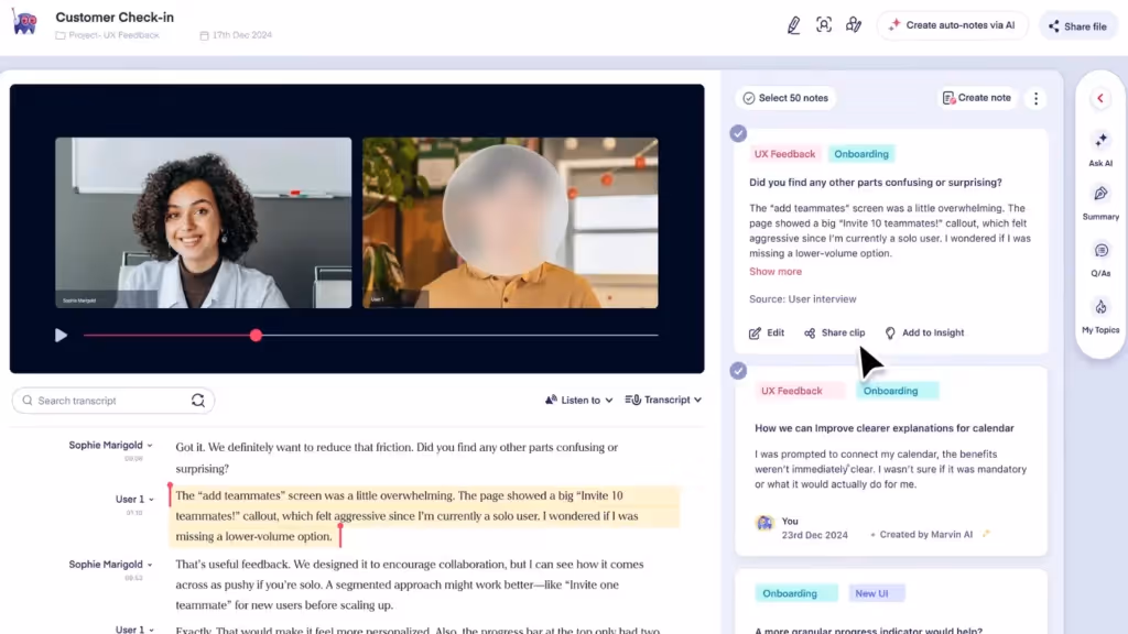
Gestalt Principles: Proximity, Common Region, Focal Point
This view shows a conversation transcript on the left and interview notes on the right. Each side serves a different function, but the layout still supports a clear visual structure.
In the transcript, proximity groups the speaker’s name, timestamp, and response. This helps the brain quickly organize who’s talking and when.
The transcript and note panel each live in their own distinct common region. The color and layout separation reinforces their roles: raw input on one side, structured notes on the other.
A single interview quote is highlighted with a background color. This draws the eye and acts as a focal point within the transcript.
Example 2: Search Dropdown with File Results
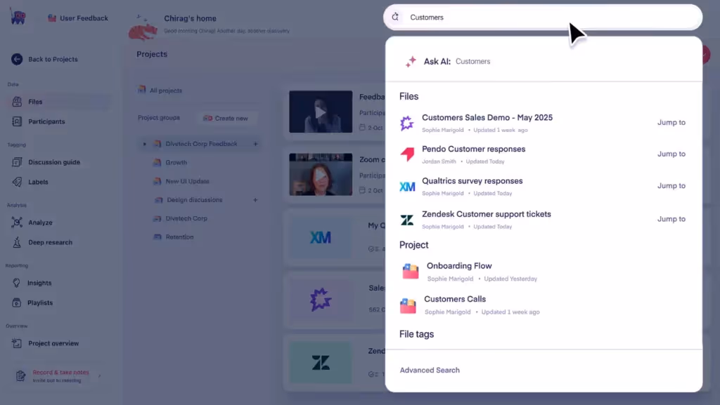
Gestalt Principles: Similarity, Common Region, Figure and Ground
In this live search view, all results follow the same layout and icon style. That’s a reflection of similarity.
The dropdown container creates a clear common region, visually separating search results from the rest of the page.
And the contrast between the dropdown and background also creates strong figure-ground separation. It makes the results easy to focus on.
Example 3: Follow-Up Interaction Panel with Tooltip
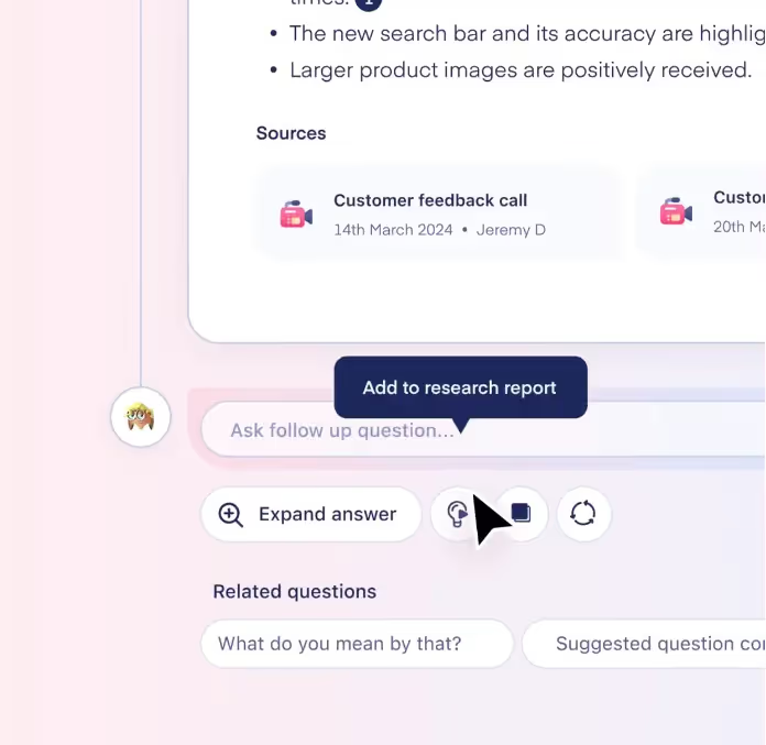
Gestalt Principles: Similarity, Connectedness, Focal Point
The three circular action buttons at the bottom of the note feel related. That’s because they share size, shape, and spacing.
But their visual grouping is reinforced by proximity. They sit in a row, forming a clear action zone.
The dark tooltip hovering over one of them becomes the immediate focal point, guiding the user’s next move.
Example 4: Discussion Guide List with Question Hierarchy
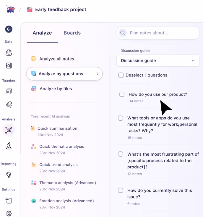
Gestalt Principles: Parallelism, Proximity, Similarity
This list view uses consistent alignment and repeated visual structure to create rhythm.
The questions follow a parallel path, helping the eye move down the page without confusion.
At the same time, labels and note counts are grouped close to their questions. This detail, coupled with the similar checkboxes, reinforces that all items are part of the same system.
Example 5: Visual Map of Supported Integrations
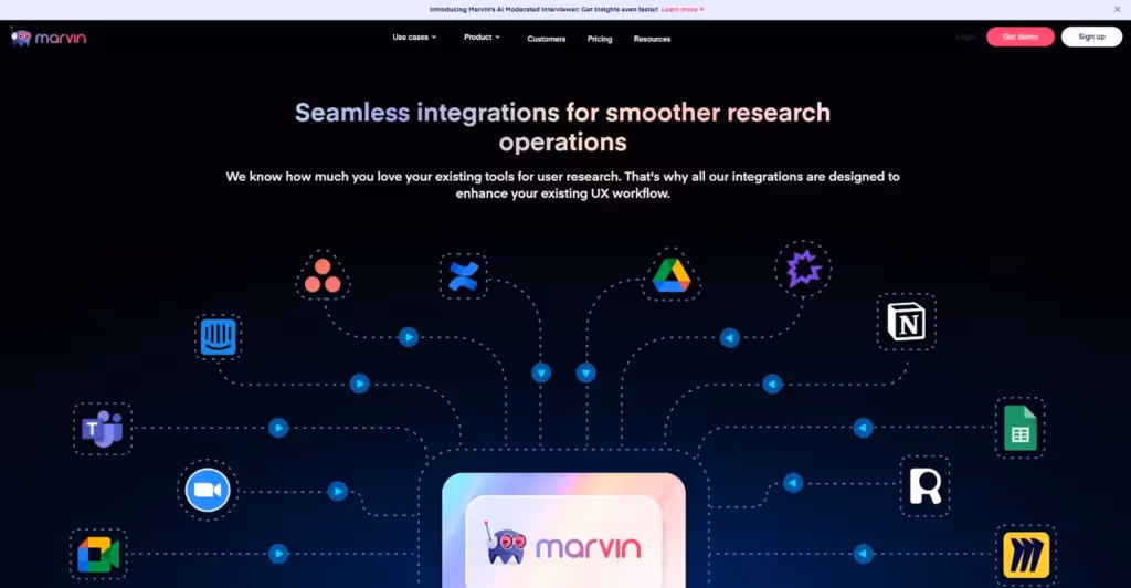
Gestalt Principles: Connectedness, Continuity, Similarity
In this diagram, dotted lines connect tools like Zoom and Google Sheets to HeyMarvin’s core. These lines demonstrate connectedness and guide your eye from icons to the center through continuity.
Every integration icon is styled similarly, forming a clean and balanced visual system that requires no explanation.
Example 6: Testimonial Panel with Bright Visual Burst
Gestalt Principles: Focal Point, Emergence, Multistability (light)
On this webpage, we feature a review alongside a glowing illustration of an AI helmet.
The starburst inside the helmet creates a strong focal point, pulling attention. The helmet’s round shape emerges before you notice its glow lines or details.
You might see the burst as light or interpret it as symbolic thinking. Either way, it shows how shape recognition guides perception.
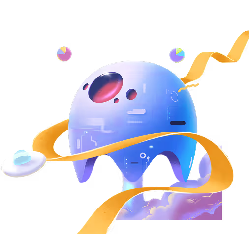
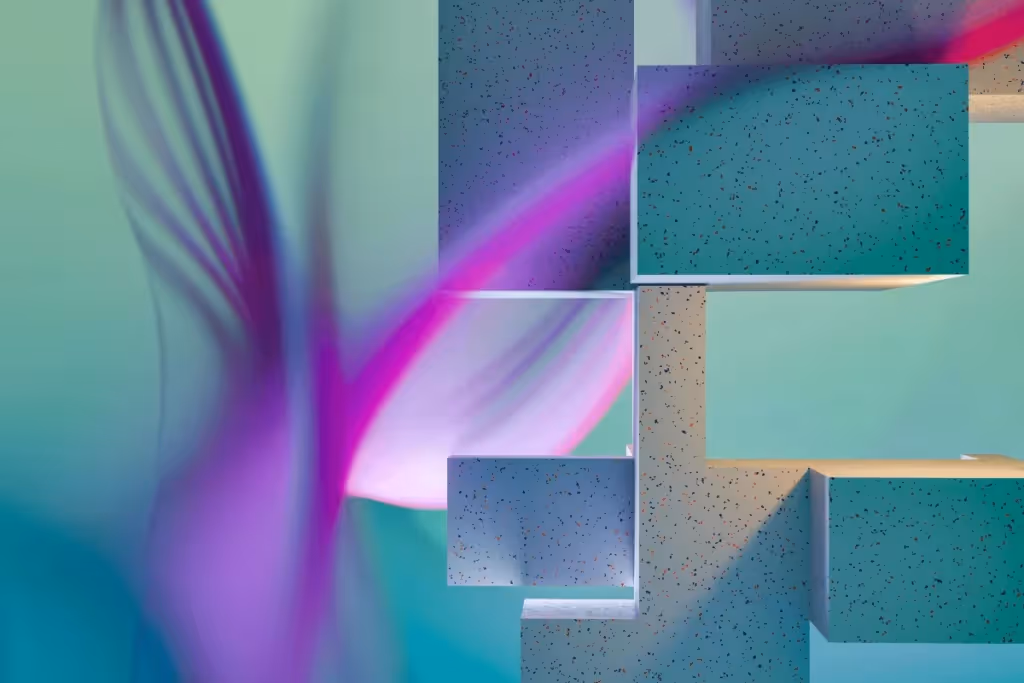
Example 7: Robot and Cat Illustration
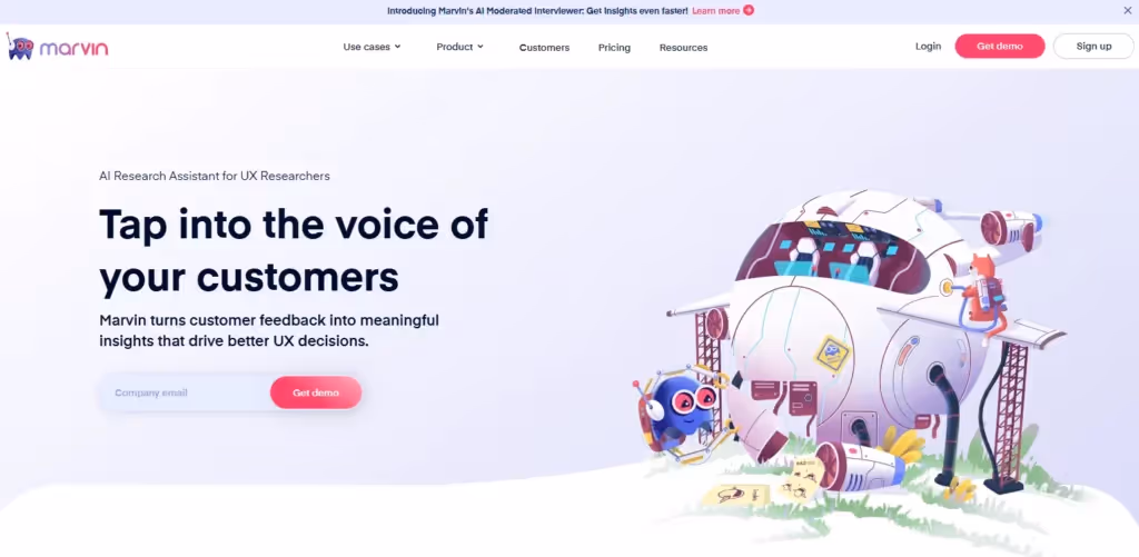
Gestalt Principles: Closure, Common Region, Figure and Ground
This hero section introduces HeyMarvin with a headline, subheading, and a clear CTA. On the left, the message is grouped using white space and alignment, making it easy to scan. The visual hierarchy supports the CTA without extra decoration.
On the right, the illustration pulls you into a playful moment. The spaceship body uses curved lines and implied shapes. Your brain completes the form without needing every edge drawn (the closure principle in action).
The entire scene is set against a soft background, creating a large, common region. Everything feels like one story, while characters and objects are pushed forward (figure-ground separation).
How to Apply Gestalt Principles in Product Development
With so many Gestalt principles, you can’t throw them all at a screen and hope for the best. You need a process to decide which principles will best serve your UX strategy.
1. Define the Mental Model You Want to Support
Determine what the user needs to understand fast. The answer tells you what kind of relationship you're trying to show and what Gestalt principle helps:
- Want users to see parts as a group? Start with proximity, common region, or connectedness.
- Need to show visual rhythm or flow? Use continuity or parallelism.
- Want to direct attention? Reach for focal point, figure-ground, or contrast.
2. Map the Structure Visually
Sketch or wireframe your layout in grayscale before adding copy or color. This lets you focus on spacing, shape, and alignment without distractions.
Look for areas where the structure is weak or ambiguous:
- Are related items grouped closely? If not, apply proximity.
- Are similar elements styled the same way? If not, fix them with similarity.
- Are you overloading users with too much at once? Use emergence to show the big idea first.
The goal is to apply common region and build visual clarity through layout grids, dividers, or containers.
3. Align Visual Flow with User Tasks
Now, think about movement. Where do you want the eye to go first, and what comes next?
Whether you’re designing a checkout process, onboarding, or dashboard layout, use continuity to guide flow. Then, align elements along a clear axis. Avoid jumps, dead ends, or zig-zags that break the mental flow.
Is there motion involved, such as elements that must load or react to user input? Turn to common fate to show what belongs together, use synchrony (elements animating at the same time) to reinforce structure through timing.
4. Strengthen Meaning with Visual Hierarchy
Once your layout flows, it’s time to establish a hierarchy.
Use a focal point to guide attention to the main action or warning. And separate important content from the background with figure/ground. Contrast, spacing, or layering also help create hierarchy.
For each screen, try to determine if users can tell what’s clickable, what’s primary, and what’s optional. If the answers aren’t clear, refine the design.
5. Test for Clarity and Misinterpretation
Finally, zoom out by asking someone unfamiliar with the feature:
- What do you see first?
- What belongs together?
- What does this screen seem to be asking you to do?
If their answers don’t match your intention, check which Gestalt rule you’ve broken. Often, minor tweaks—such as tighter spacing or more consistent button styles—make a significant difference.
Frequently Asked Questions (FAQs)
The following FAQs on Gestalt principles will help you better connect the dots with design:
How Are Gestalt Principles Used in Everyday Design?
Offline, the Gestalt principles are evident in signs, maps, packaging, and other visual elements. Online, they’re likely present in:
- Cards grouped by proximity
- Icons repeated using similarity
- Clear CTAs that pop with a focal point
- Navigation flows built on continuity
What Makes Gestalt Psychology Relevant to UX Teams?
UX teams use Gestalt psychology to reduce friction and design for perception, not just function. Designers leverage it to:
- Allow users to identify patterns without extra labels
- Inform layout and spacing decisions
- Keep the interface clutter-free
- Enhance hierarchy and clarity
How Do I Start Using Gestalt Principles in My Projects?
The best way to start is by working in grayscale. This will force you to focus on structure instead of style. From there, group elements that belong together and suggest flow with alignment or spacing.
When your layout feels clear without color or text, add styling to reinforce meaning. Finally, employ user testing to detect where people hesitate and what principles you’ve missed.
Conclusion
The best product designs look good and feel right. That feeling comes from a structure that users don’t notice. But their brains do. Such is the power of Gestalt principles in graphic design.
Still, even rule-following designs can miss the mark if you don’t know how users interpret them. That’s why direct feedback captured with HeyMarvin is essential.
Whether from interviews, surveys, or open-ended responses, our platform helps you hear how users describe your design. Then, it quickly analyzes it all.
Want to see where visual understanding and user expectations no longer align? Create a free HeyMarvin account and centralize your research. With AI-powered tagging, sentiment, and theme analysis, you’ll figure it out fast.

See Marvin AI in action
Want to spend less time on logistics and more on strategy? Book a free, personalized demo now!